The Final Shoot
Shot in my house, using natural light as to not get obvious and unnatural gleams off the jar. Shot with a Samsung smart camera NX.
Editing.
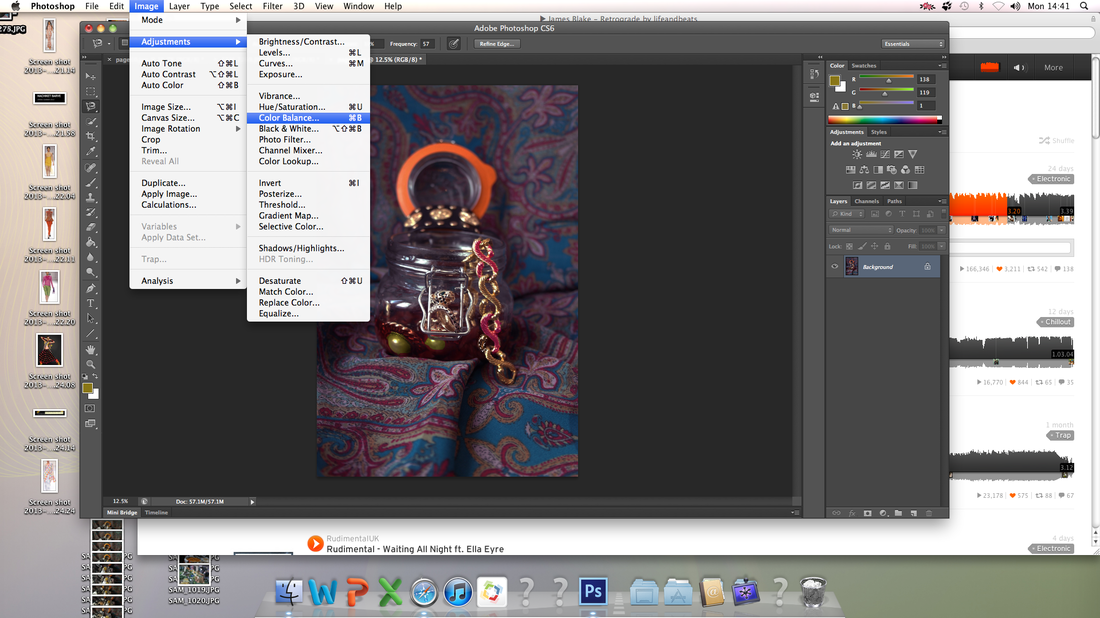
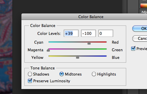
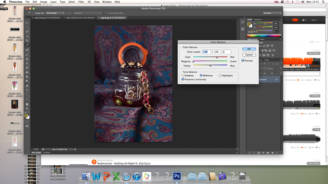
Here is an example of me changing the colour balance o the Versace bracelet. Instead of physically changing the appearance of the bracelet I sourced I edited the colour to show the neon theme that is shown within the Spring 2013 Couture show.
The Final Images
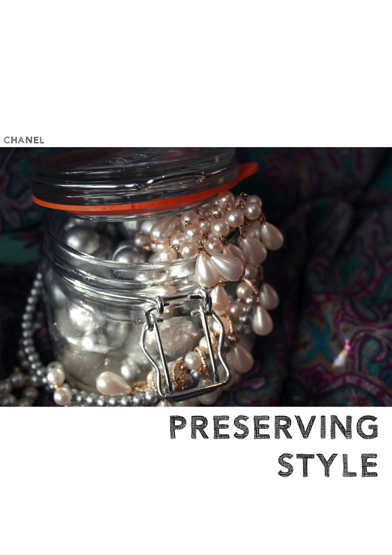
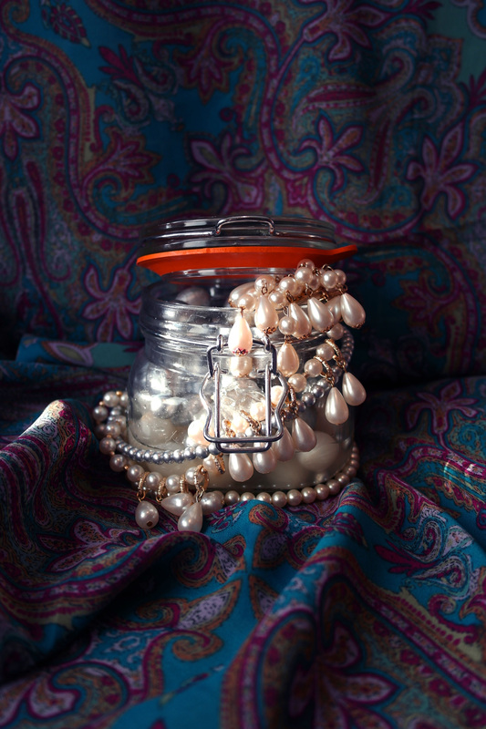
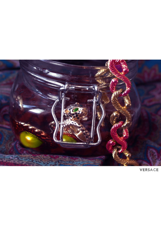
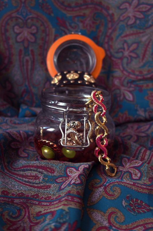
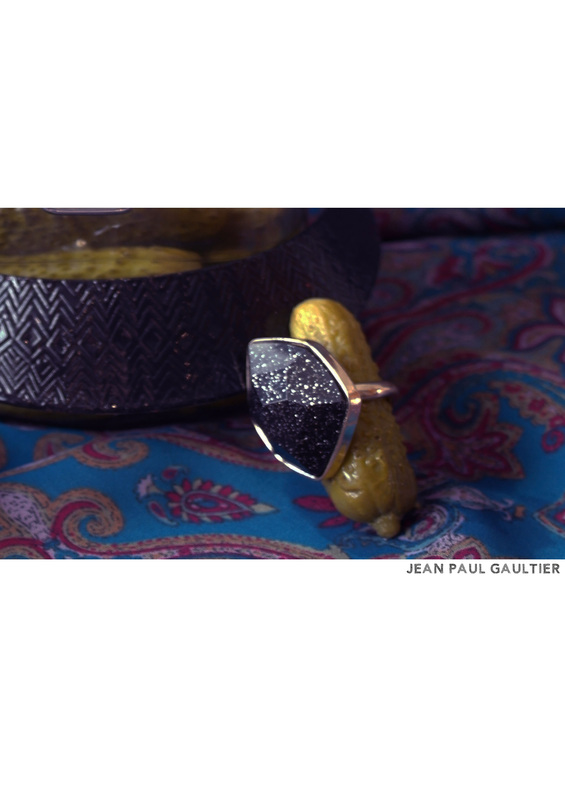
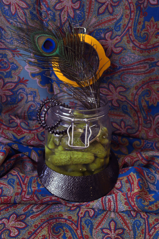
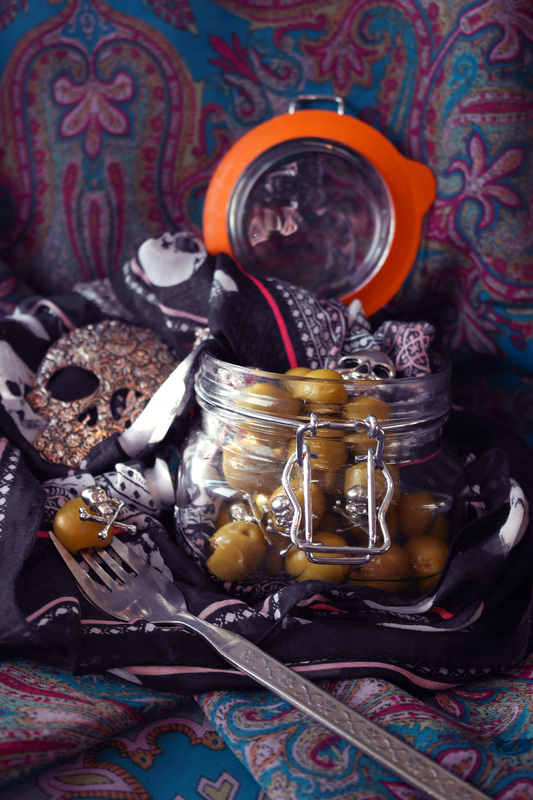
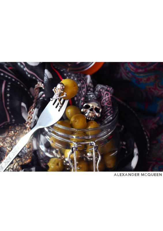
I am very happy with the final outcome of my shoot, the original images were not working as well however, through the use of my own careful editing and the layout I think overall, the images not only compliment each other, they have a clear narrative and advertise the jewellery incredibly well. Jewellery is all about detail, therefore I though it was very important to have a smaller cropped image next to the original to help show this.
The editing consisted of darkening and warming the colour temperature of each image, increasing the colour balance of the reds blues and creating more saturation I was able to make the colour in the images really stand out. The warmth of each picture especially within the material gives the editorial a paint like feeling. Instead of standard issue pictures the have become pieces of art and have a sense of luxury. I loved this effect because although the jewellery advertised in many magazines is luxurious, it is never reflected through the background and set.
The layout is similar to the of LOVE magazine, by using the white space I am able to confide the cropped image making the audience view more focused upon the image. It also gives the editorial, as a whole, a more modern feel, very minimal in comparison to the images.
